About
CONTEXT
In 2021 Elfin Market rebranded and my task was to redesigned their website to match. The project had several stages, starting with public pages and slowly improving customer dashboard afterwards.
KEY PHASES
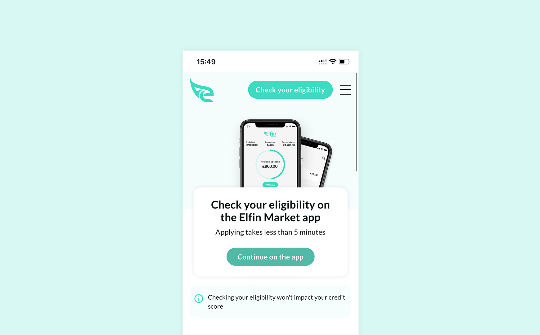
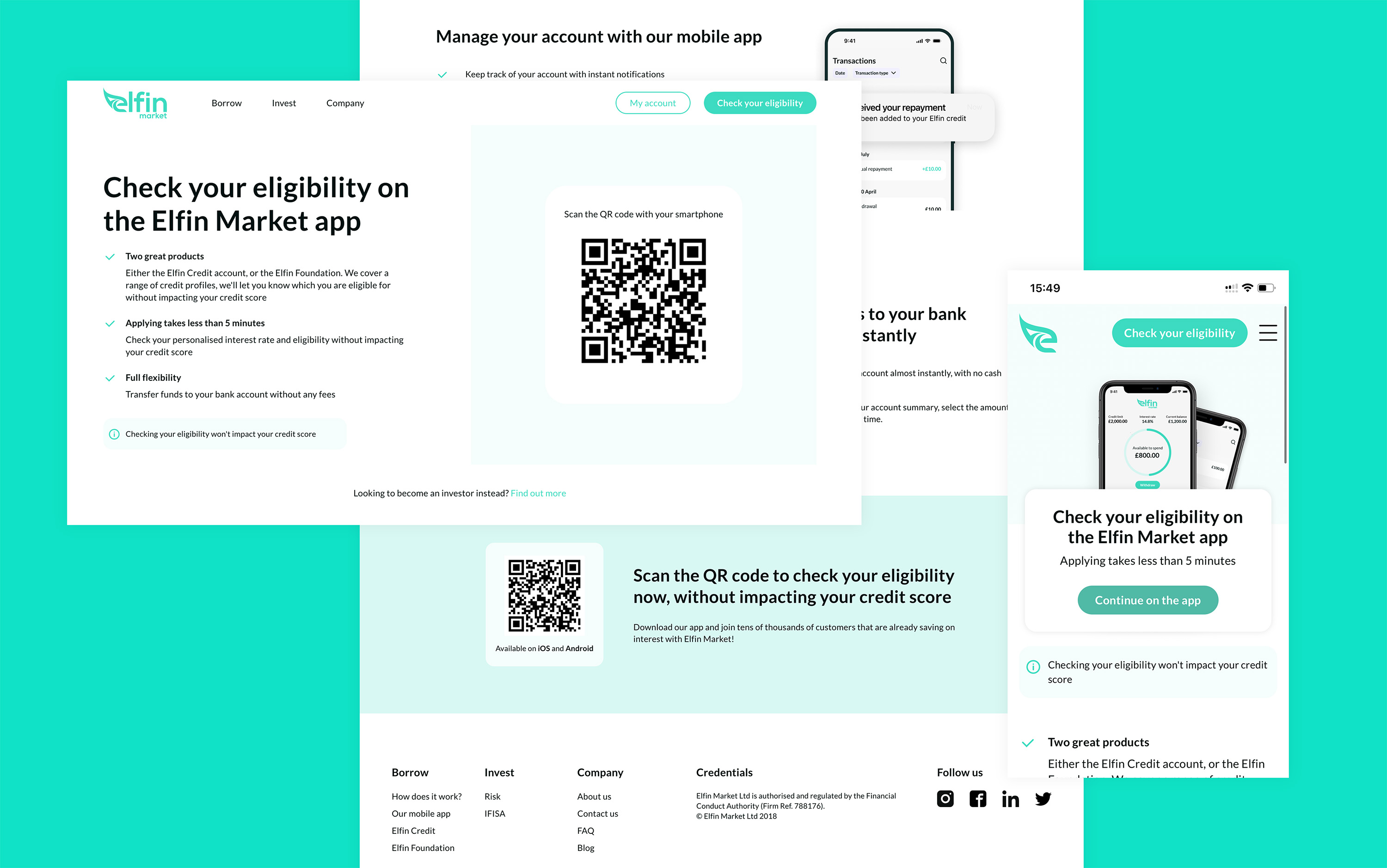
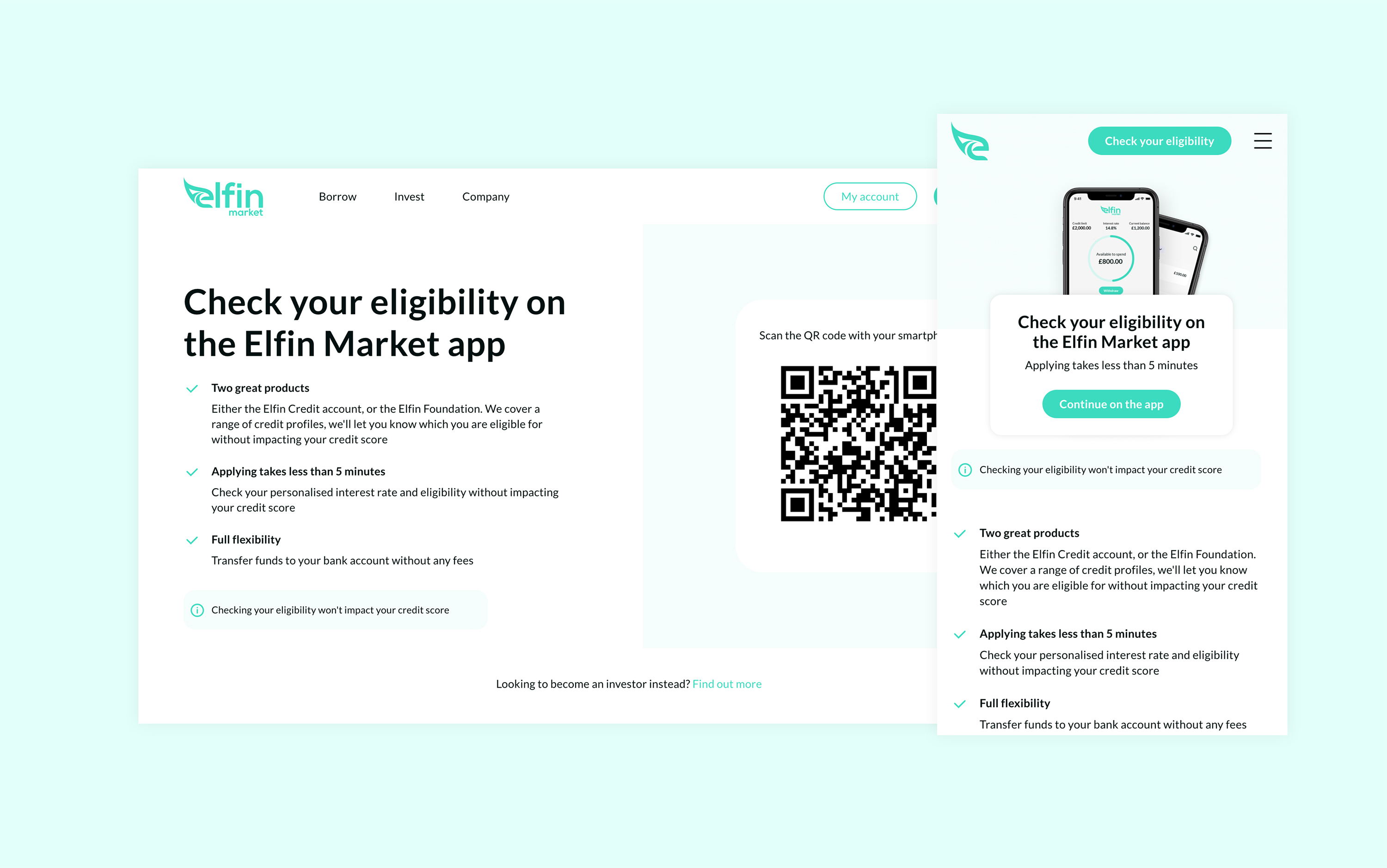
Public pages were a priority as Elfin had a deadline in mind for the full launch of their card (beta stage at that point)
User profile and dashboard had a basic redesign to match the new branding, howerver, the full redesign followed after the card launch
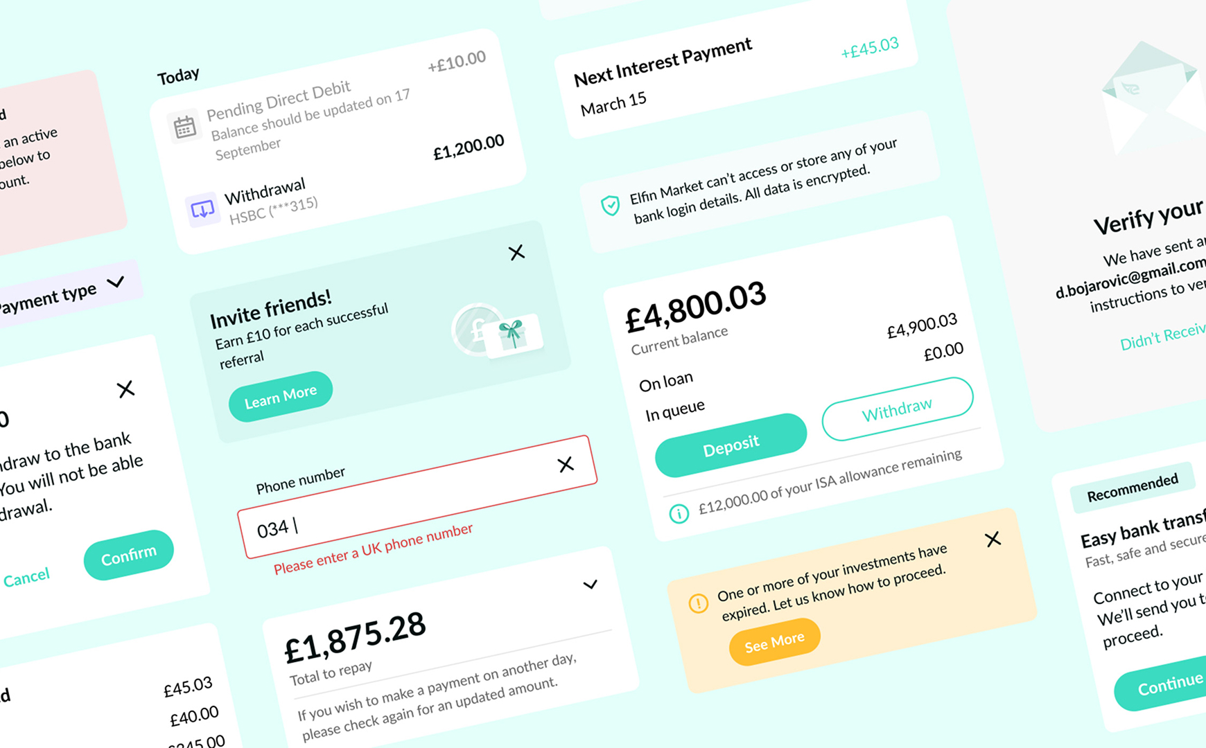
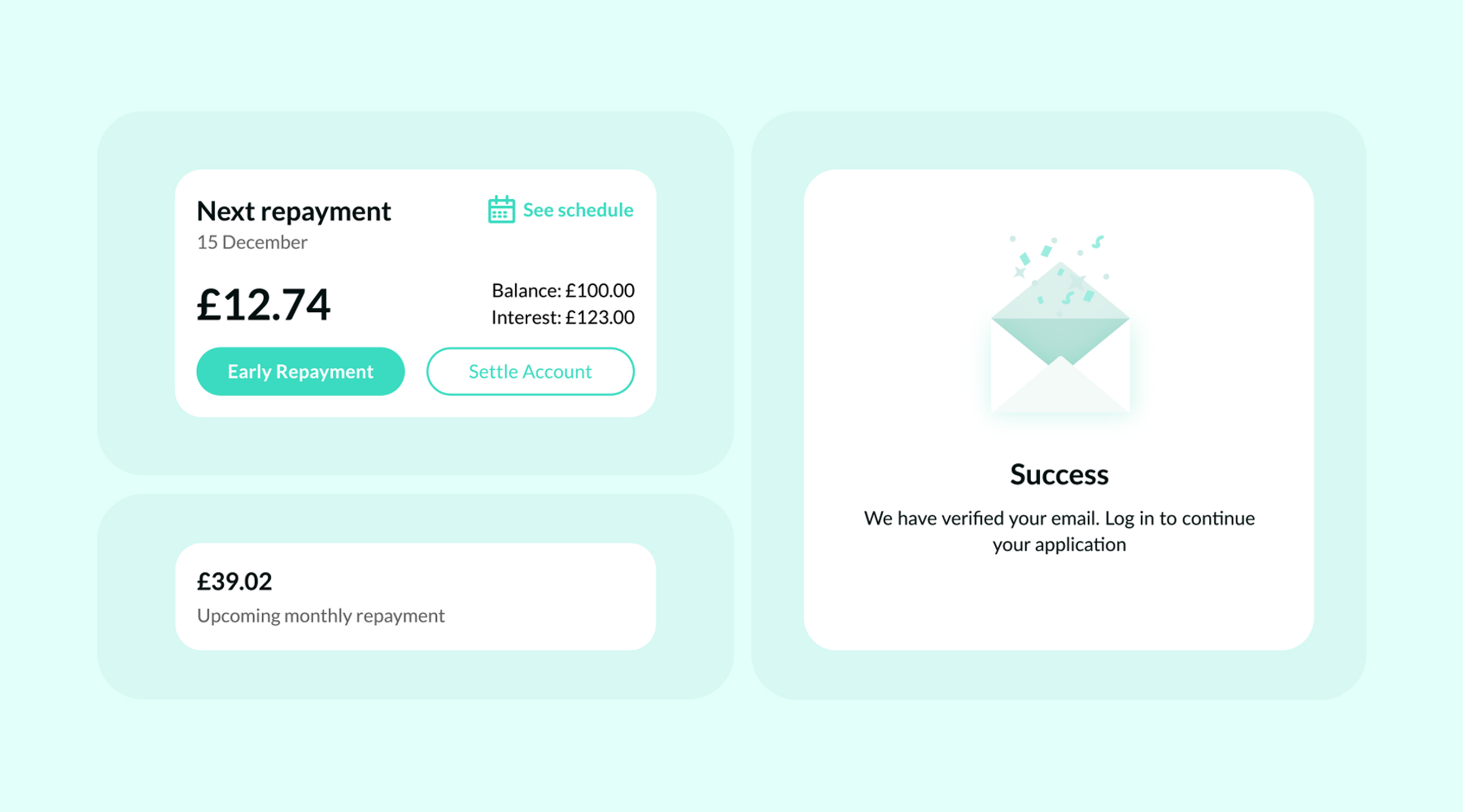
User dashboard was and ongoing project, while we added new features and improved UX along UI
CHALLENGE
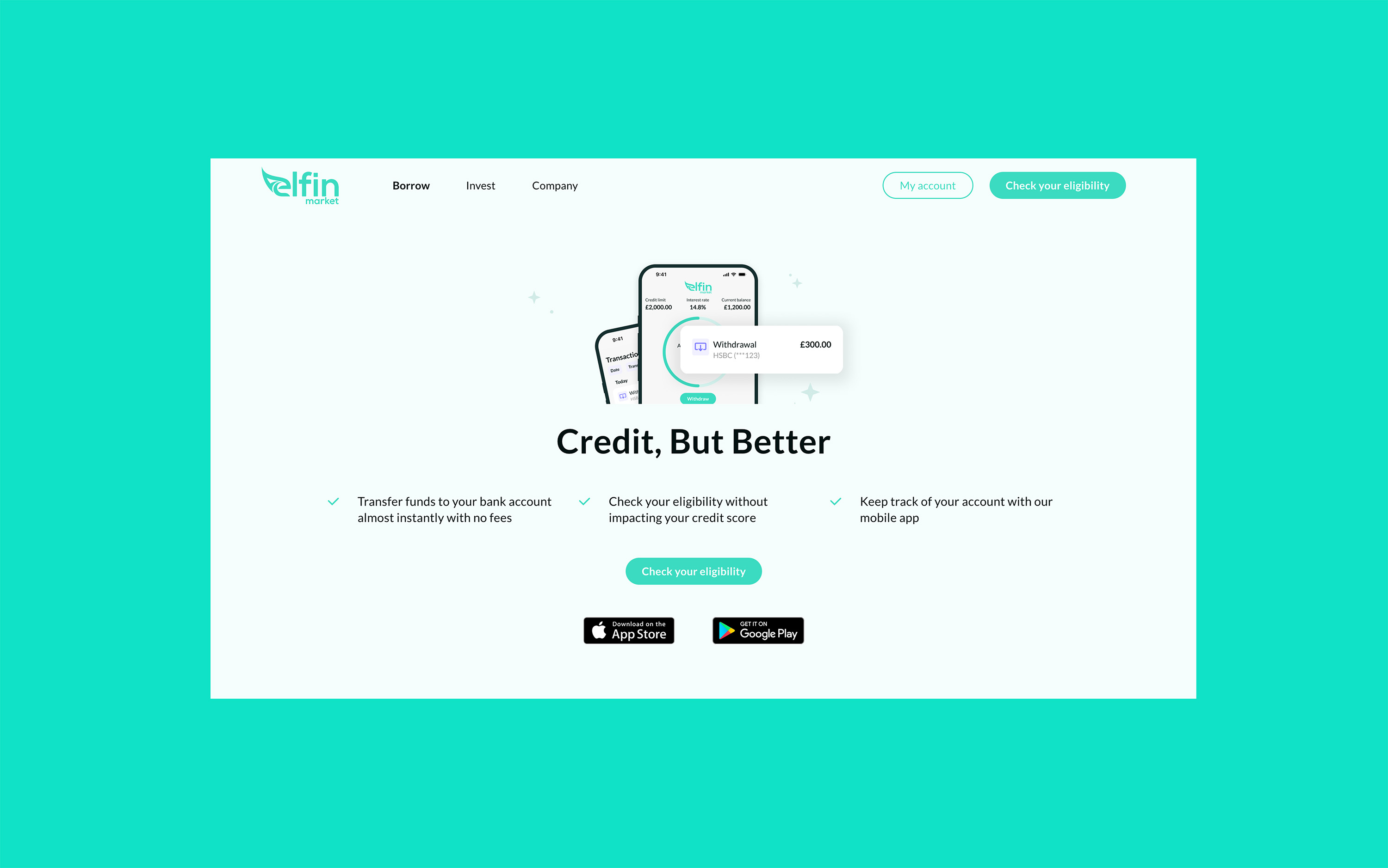
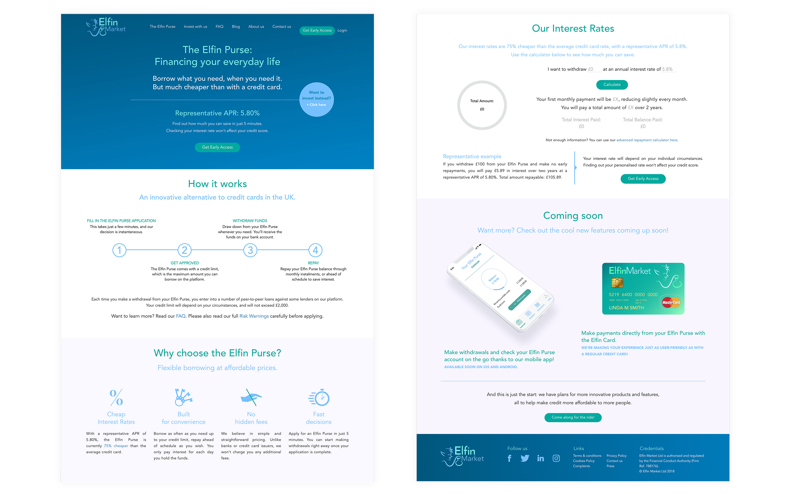
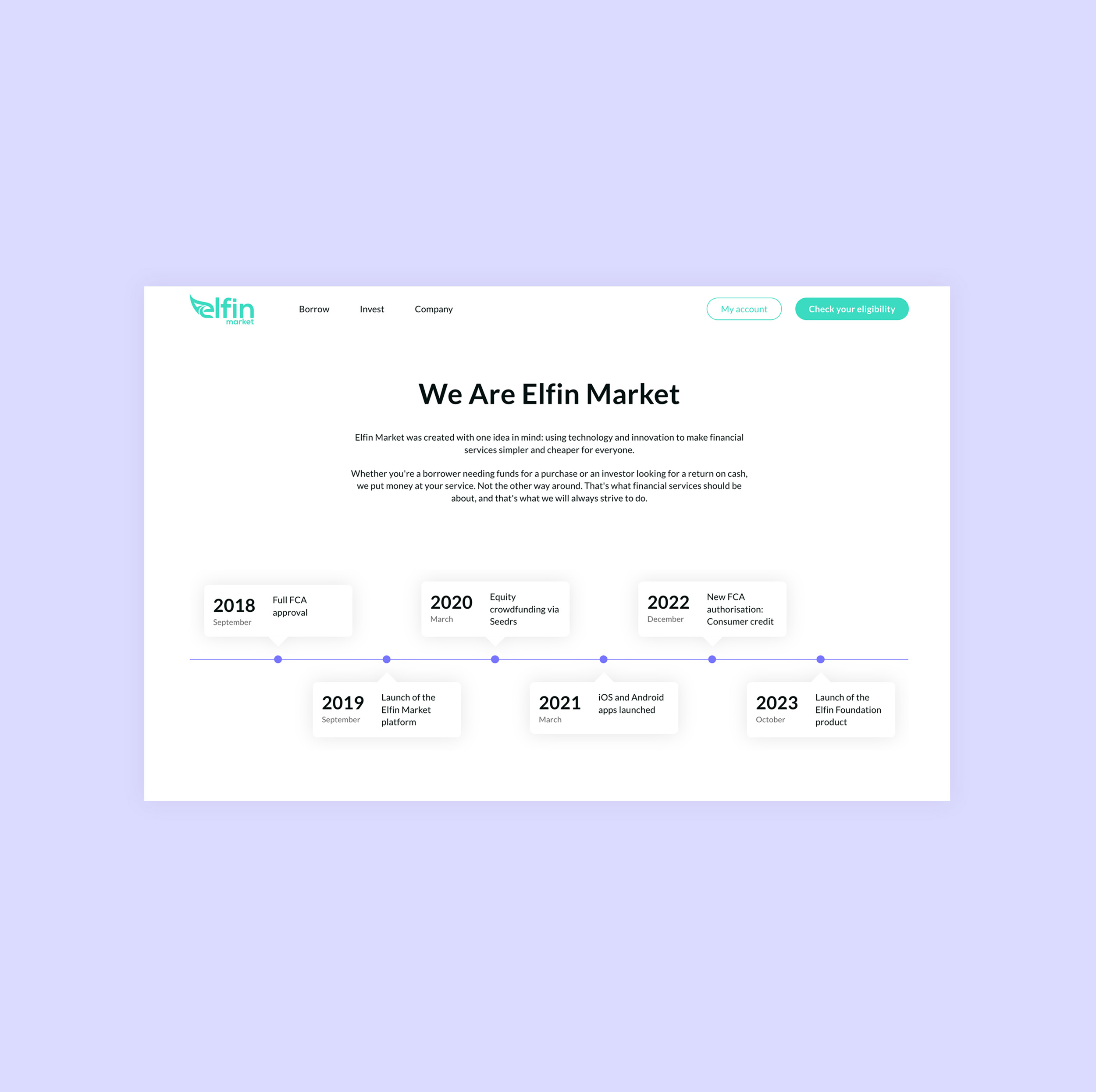
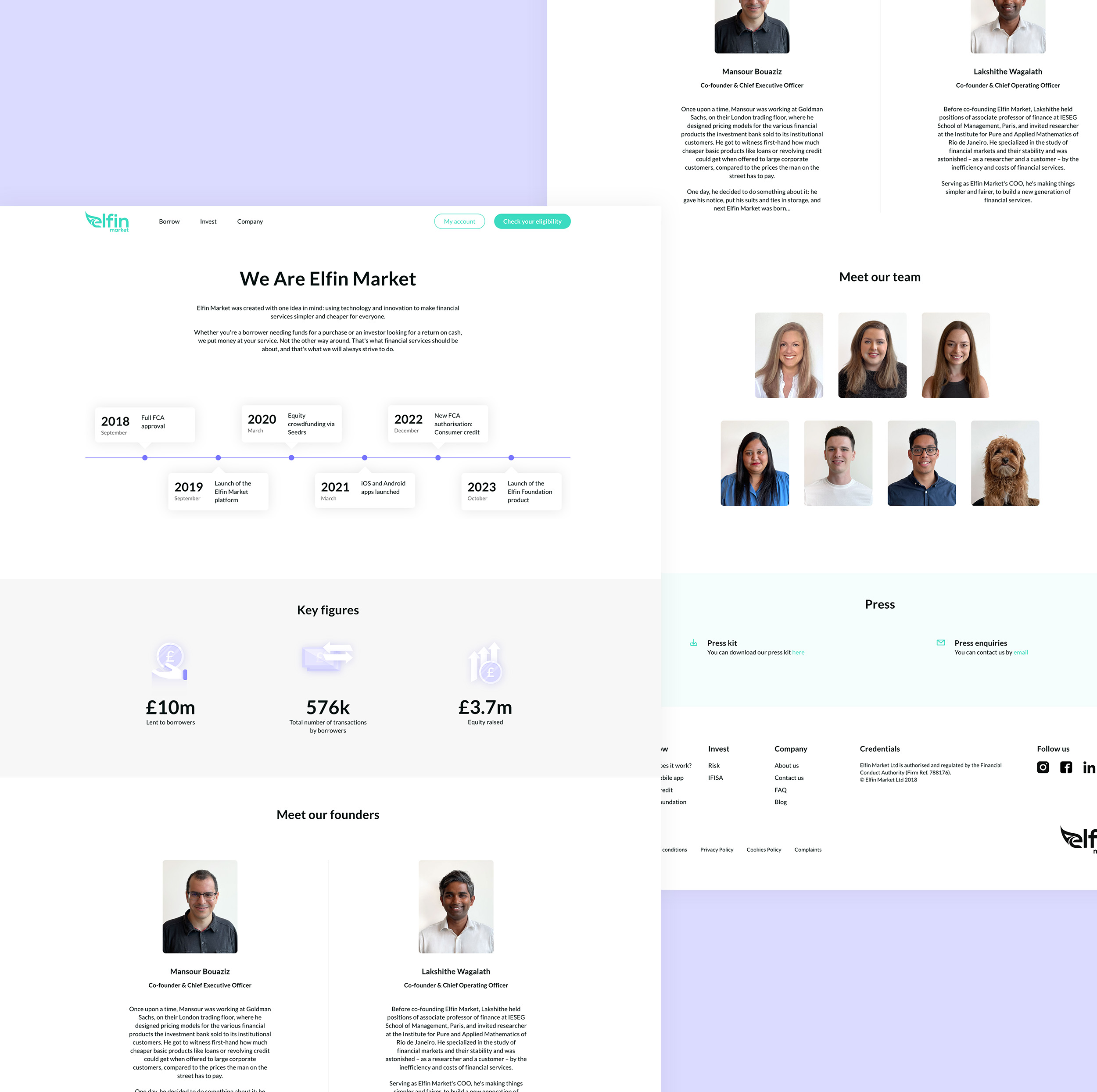
When I joined the project, the existing Elfin Market website felt dated, inconsistent, and was difficult to use. Although the information was there, the overall experience lacked clarity, structure, and a sense of trust that's critical for a financial product.
SOLUTIONS
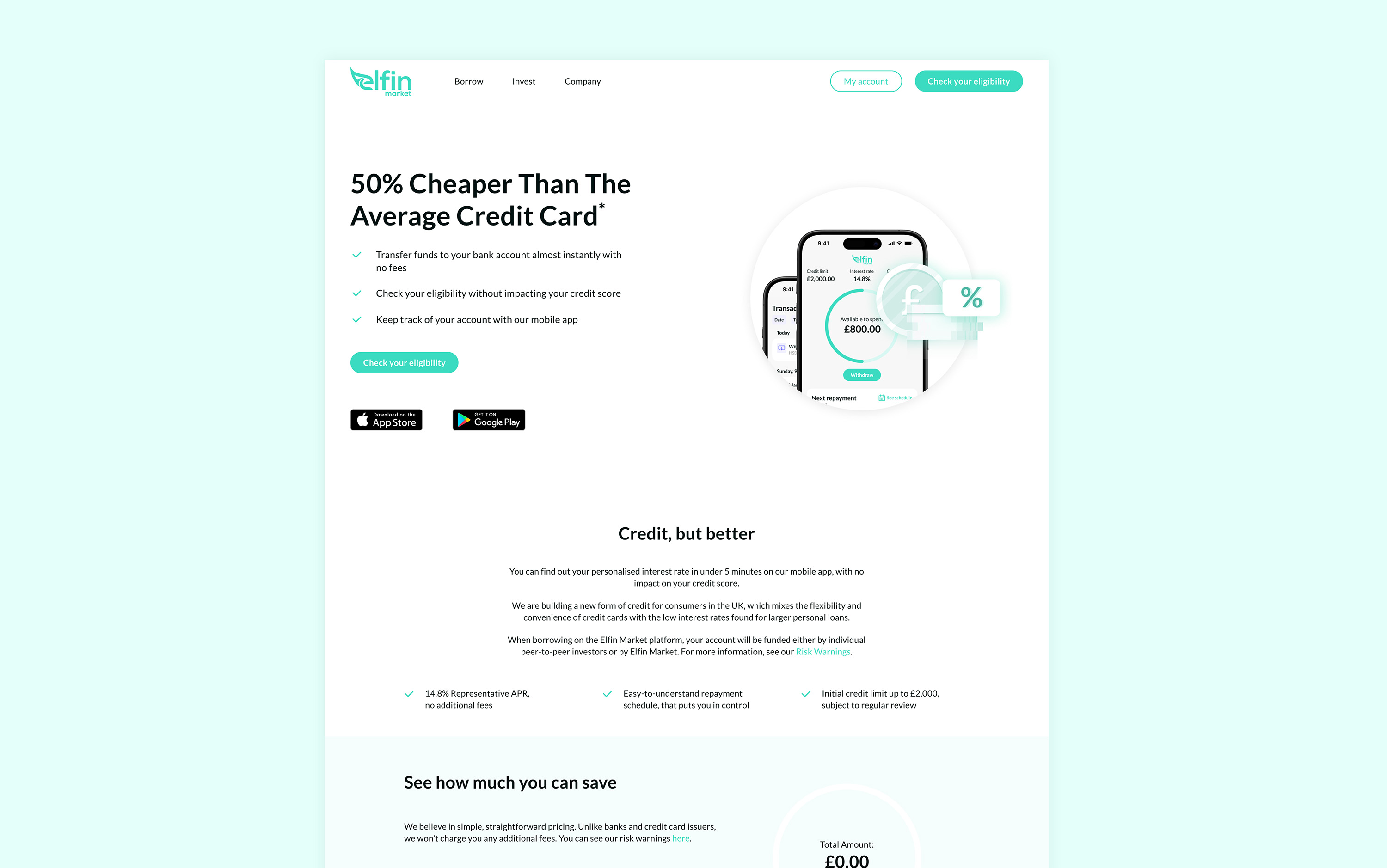
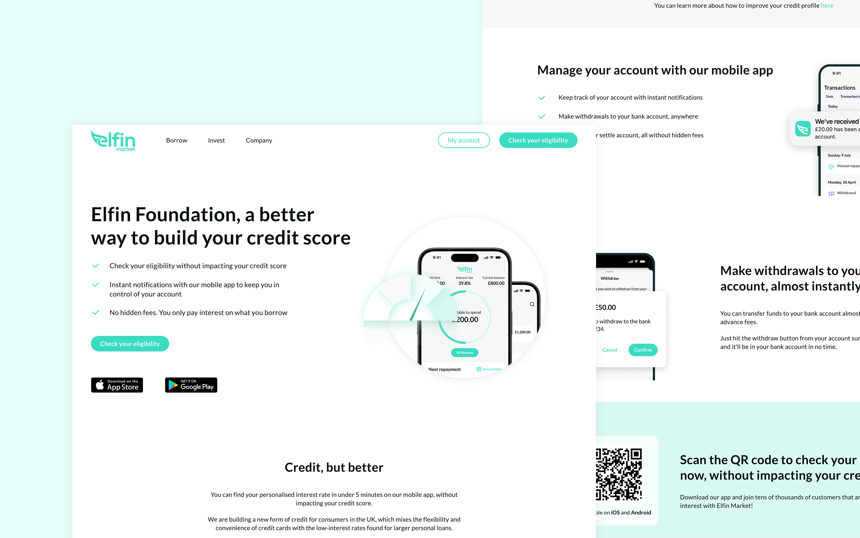
The content was restructured to highlight key benefits and guide users through simplified steps, supported by consistent CTAs and visual cues.
IMPACT
A cohesive visual system, consistent typography, and clearer hierarchy helped build trust and align the website with Elfin's fintech identity
Streamlined copy, visuals, and CTAs led to more users completing eligibility checks and engaging with the mobile app
Having one source of truth on Figma meant less miscommunication.